IMMA.ie
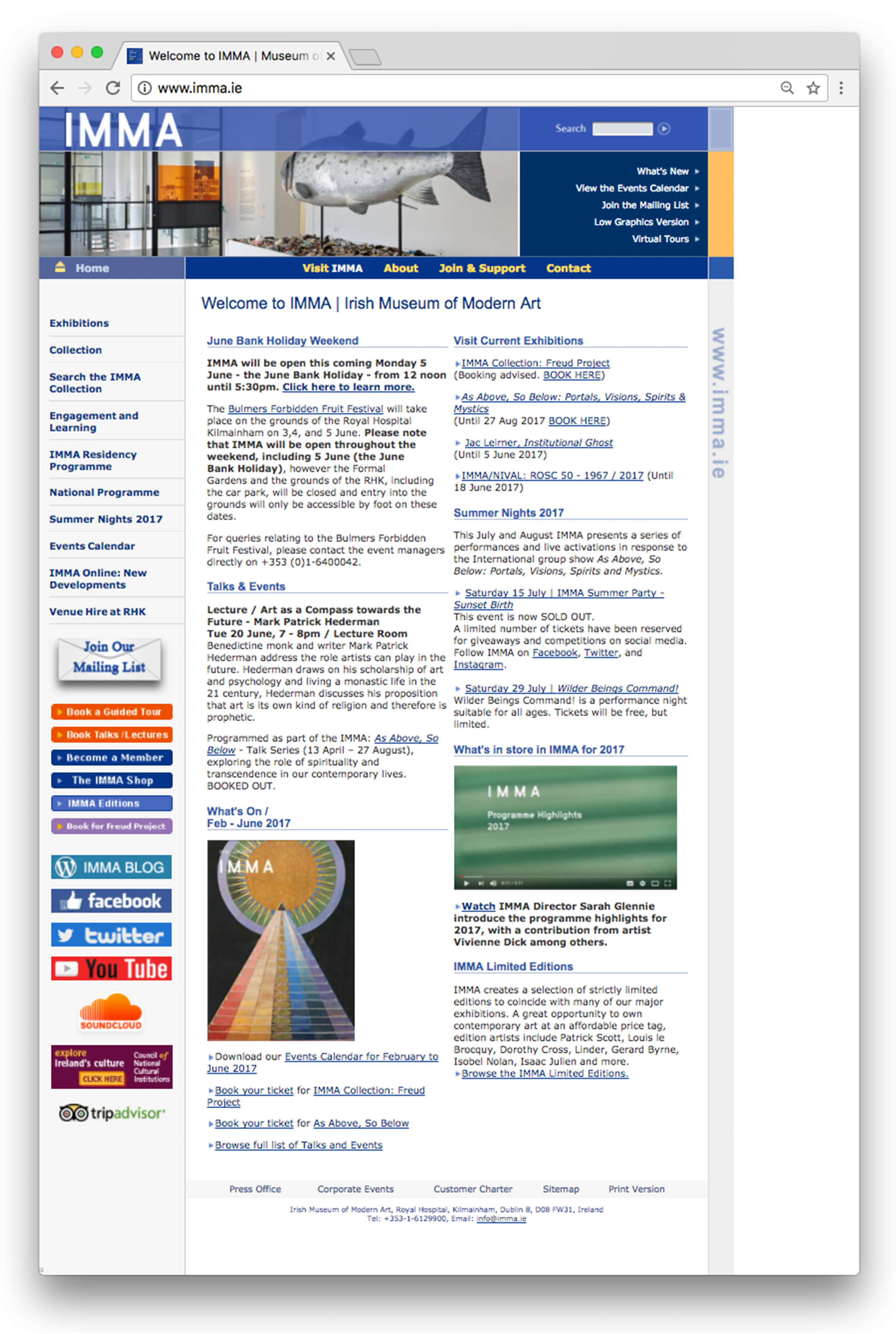
The website of IMMA (Irish Museum of Modern Art) looks / feels quite dated and it is missing an essential feature: Design & Usability.
This site is not what a modern art museum should be showing to the public so for this project, I decided that I was going to take from an area I am very interested in (art) and use the other area I am very passionate about (design) and produce something new and exciting.
The actual site layout is busy and very confusing for visitors. A modern art museum website should reflect their image offline and I think, nowadays, people might not feel encouraged to visit a museum if they can’t navigate the site properly, it’s poorly designed and most importantly if they cannot find the information they're looking for.
Critique of Site
Visual Assessment
The IMMA site is not very visually appealing or exciting to the visitor, it gives you a chaotic feeling which does not reflect the reality of visiting the Museum.
At first glance, there’s no hierarchy because everything you see on the homepage is at the same level of visual importance; font size, colours, position.
The entire site seems to be in a blue and dark colour with bits of yellow. Most menus, titles and links are at the same level in the same font size so it is quite hard to the casual eye to differentiate the importance of particular information.
The only part that takes your eye visually is the list with the different high contrast coloured buttons and the different social media profiles listed on the left-hand side underneath the envelope icon.
Practicality
As mentioned, IMMA has an overall hard to navigate website with a very busy homepage.
To start with, there are three different navigation menus,
- The first at the top right underneath the “Search” function with a small white font.
- The second one horizontal underneath the main image, which looks like the "main menu", with a yellow bold font
- The third on the left-hand side in a bold blue font followed by what seems to be a list (or perhaps another menu) with a lot of different high contrast coloured buttons for the visitor to be able to book tour tickets and, last but not least, all the museum’s social media profiles.
From a visitor perspective, and in my opinion, this is not a practical site. It is hard to find what I think is the most important thing when you come to an art museum’s website...
|“What's the exhibition that's happening right now and how do I get tickets?”
To be able to answer that question you need to find the menu where “Exhibitions” is, underneath the “Home” symbol, click to get another menu ( "Current Exhibitions", "Forthcoming Exhibitions", "Past Exhibitions") and then click again on “Current Exhibitions” to be able to see what exhibitions are on show at the moment.
Once there, you can click again on the exhibition you want to know more about and finally get to the exhibition page and book a ticket for it.
In my opinion, too many clicks for the visitor to find vital information about the museum’s main attraction, the exhibitions.
Planning Documents
I want to produce a big bold new design with a modern twist because at the end of the day, IMMA is the National Museum of Modern Art and their site should definitely reflect that.
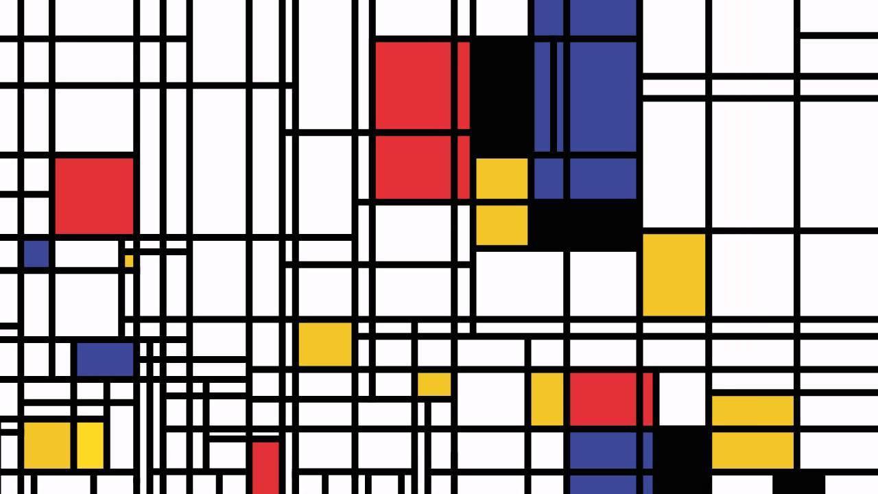
I was very inspired by Piet Mondrian (style) images (specifically the one below).
The use of thick black lines (as guides) with the different position of the colured squares, giving a framing structure.
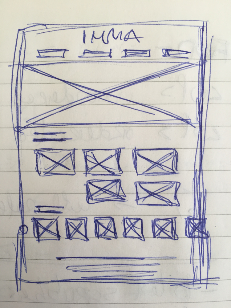
Initial Sketches
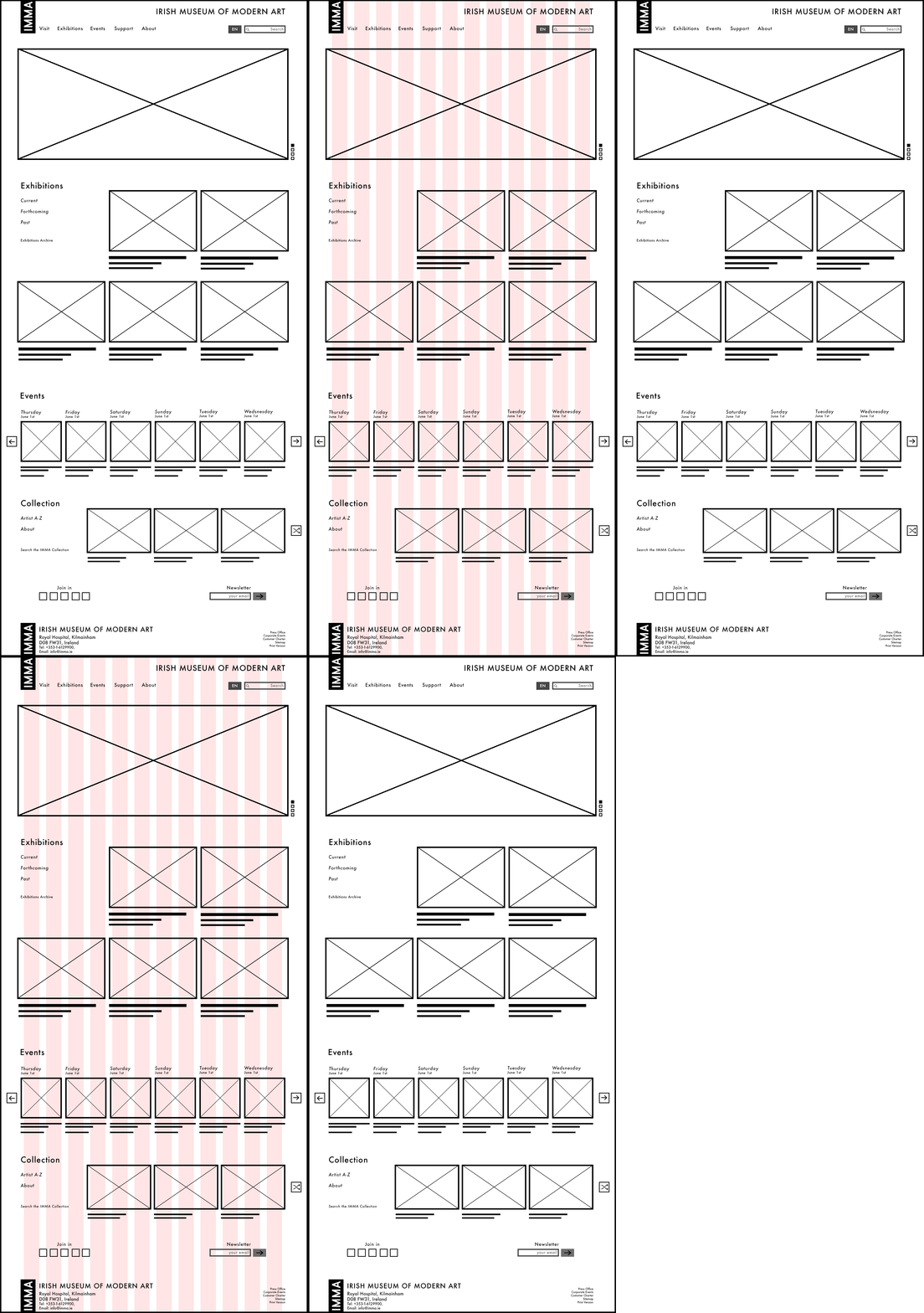
Home HI-FI WireframE
Layout
I wanted to take the site and strip everything down. As I have shown, I was very inspired by how Piet Mondrian framed his coloured squares to almost give them a higher visual importance so I wanted to take this idea and use it for the site.
Colour & Typography
For this project, I selected a simple, classic and easy to read font. I also wanted to keep the colour palette on the site to a minimum so the images of the artwork could take all the importance and talk to the visitor directly.
For the colours, I just picked two types of grey for the site. Colour HEX #959595 as a primary and #616161 and for accents.
On the typography side, I’ve chosen Futura. Futura is a geometric and readable sans-serif typeface designed in 1927. This font gives a classic but modern feel to the whole project without taking too much importance from what is the main focus of the site and of the overall Museum experience, the beautiful artwork.
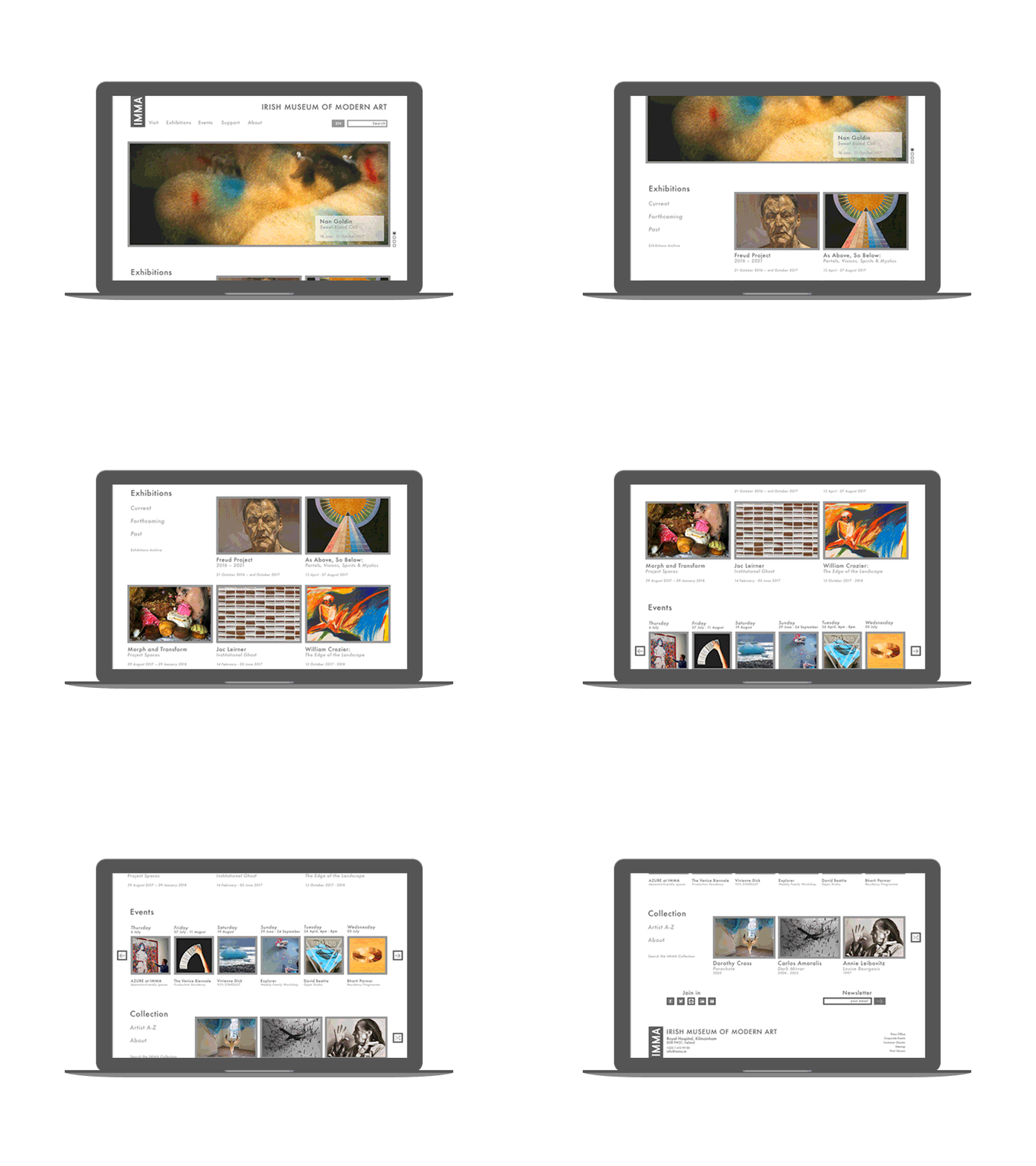
The new proposed homepage is now separated into 4 main sections as you scroll down
“MAIN MENU”/“SLIDER” section, will showcase the current exhibitions, exciting news, etc.
I created a very simple menu and added a new language feature for non-English speakers next to the search box.
A new semi transparent square feature will appear at the bottom right of the artwork when you hover over with the mouse. This will contain information about the exhibition or/and artist. (This feature will also be used to credit all artwork to artist throughout the site)
“EXHIBITIONS” section, where the visitor can not only see what's on at this particular moment but check and review past and forthcoming exhibitions as well as having access to the full IMMA exhibition archive.
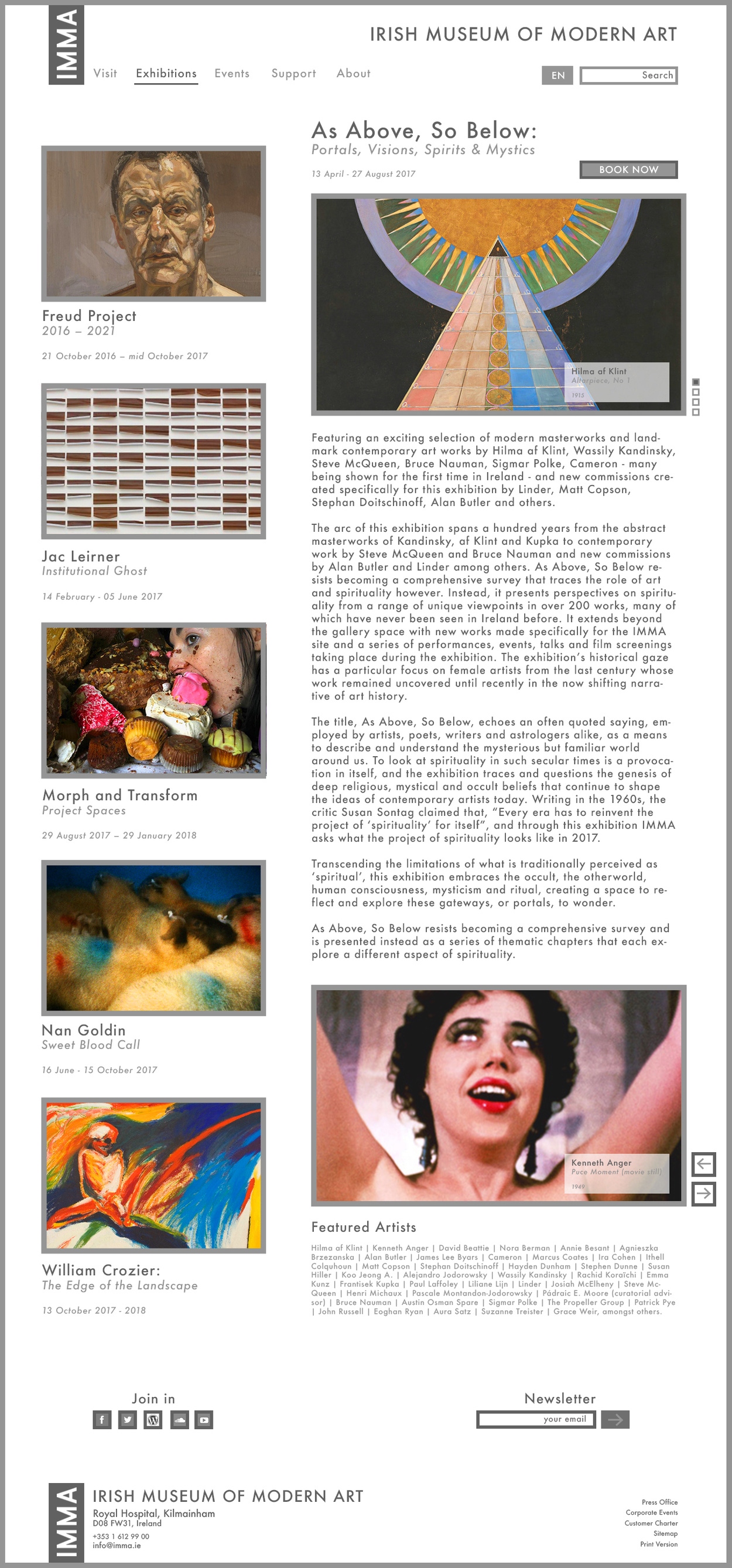
Please see this has also been redesigned as a page, with more detail, as part of this project (see below).
I added a “Book Now” button next to the main title of the exhibition so the visitor has easy access to buy tickets for the exhibition they're reading about.
I’ve also used a slider to showcase the main artwork of the current exhibition.
As mentioned, the hover over square feature will appear to credit artwork to artist.
Another artwork showcase gallery at the bottom of the page has been added.
- “EVENTS” section, the visitor will be able to navigate with the carousel to see what’s happening and what’s coming to the Museum.
- “COLLECTION” section, where visitor can get a taste of the permanent IMMA collection.
The visitor will be able to learn more about it, access to an "A-Z list" of all permanent artists or search the IMMA collection archives to discover more.
A “Randomise” button feature has been also added where the visitor will be shown three random artworks from the collection at any given time without them having to go through the whole catalogue.
